目录
1/3
2/3
3/3


Flutter3.3对Material3设计风格的支持

收录于文集
共15篇
在Flutter3.3版本以上,支持Material3,使用Material3样式首先是要配置启用Material3。
Material3 主要体现在 圆角风格、颜色、文本样式等方面。
UP主的推荐
深度探索Flutter——企业应用开发实战(计算机技术开发与应用丛书)
¥77.2起
UP主的推荐
Flutter组件精讲与实战(套装上下册)/计算机科学与技术丛书
¥253.3起
UP主的推荐
Flutter基础与实战 从入门到APP跨平台开发
¥106.43起
1 配置启用 Material3
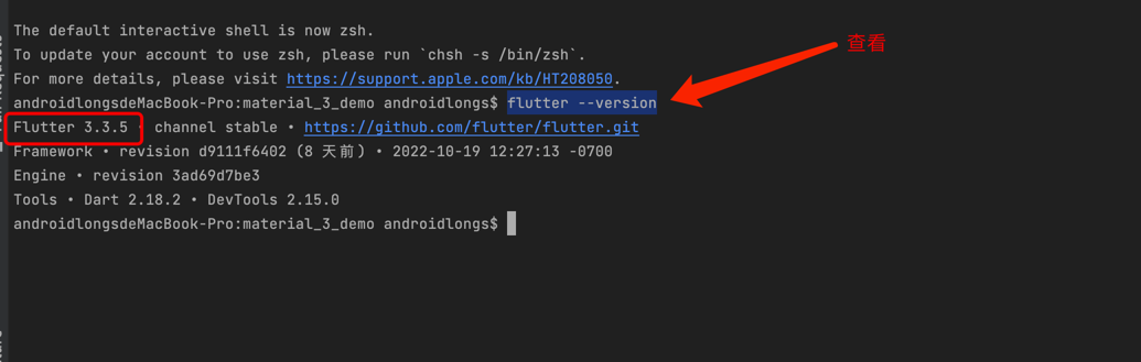
查看当前 Flutter的版本
在程序的入口 MaterialApp中设置主题ThemeData中的useMaterial3属性为true.
代码块
Dart
自动换行
复制代码
///flutter应用程序中的入口函数
void main() => runApp(TextApp());

///应用的根布局
class TextApp extends StatelessWidget {
  @override
  Widget build(BuildContext context) {
    ///构建Materia Desin 风格的应用程序
    return MaterialApp(
      title: "Material3",
      ///在主题中启用
      theme: ThemeData(
        brightness: Brightness.light,
        colorSchemeSeed: Colors.blue,
        //启用
        useMaterial3: true,
      ),
      ///默认的首页面
      home: Material3Home(),
    );
  }
}
复制成功
2 按钮样式的改变
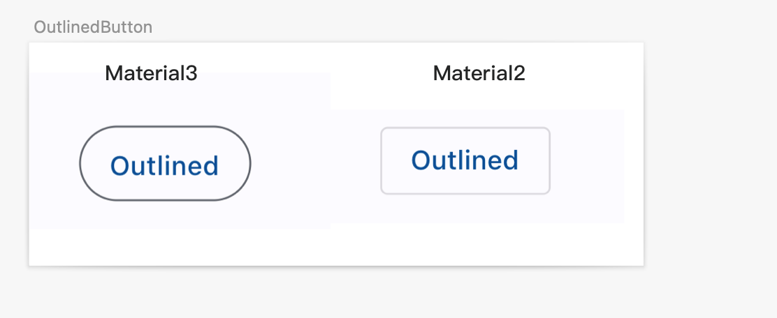
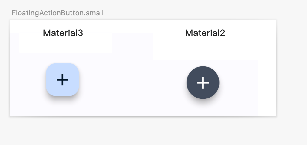
按钮默认的圆角大小改变
2.1 ElevatedButton
代码块
Dart
自动换行
复制代码
ElevatedButton(
   onPressed: (){},
   child: const Text("Elevated"),
 ),
复制成功
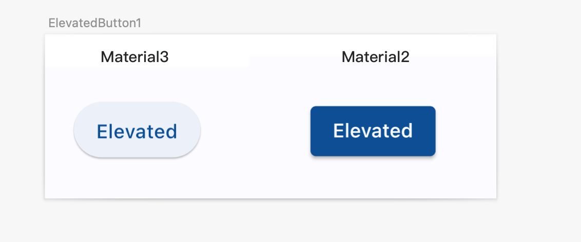
2.2 ElevatedButton 自定义样式
ElevatedButton 可通过 style 来设置样式,onPrimary 属性来设置前景色,比如这里的文本的颜色,primary 用来设置背景色,也就是这里的ElevatedButton按钮的填充颜色。
代码块
Dart
自动换行
复制代码
  ElevatedButton(
     style: ElevatedButton.styleFrom(
       // 前景色
       // ignore: deprecated_member_use
       onPrimary: Theme.of(context).colorScheme.onPrimary,
       // 背景色
       // ignore: deprecated_member_use
       primary: Theme.of(context).colorScheme.primary,
     ).copyWith(elevation: ButtonStyleButton.allOrNull(0.0)),
     onPressed: (){},
     child: const Text('Filled'),
   ),
复制成功
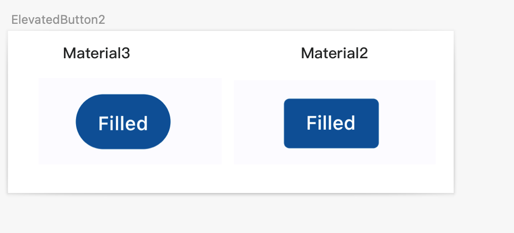
2.3 OutlinedButton
代码块
Dart
自动换行
复制代码
OutlinedButton(
     onPressed: (){},
     child: const Text("Outlined"),
   ),
复制成功
2.4 FloatingActionButton.small
代码块
Dart
自动换行
复制代码
 FloatingActionButton.small(
    onPressed: () {},
    child: const Icon(Icons.add),
  ),
复制成功
2.5 FloatingActionButton
代码块
Dart
自动换行
复制代码
FloatingActionButton(
   onPressed: () {},
   child: const Icon(Icons.add),
 ),
复制成功
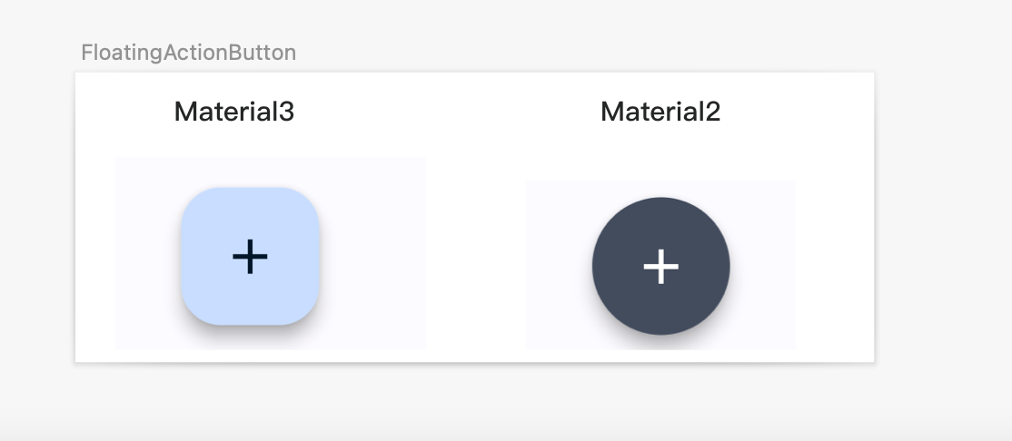
2.6 FloatingActionButton.extended
代码块
Dart
自动换行
复制代码
   FloatingActionButton.extended(
     onPressed: () {},
     icon: const Icon(Icons.add),
     label: const Text("Create"),
   ),
复制成功
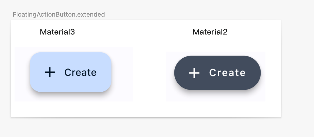
2.7 FloatingActionButton.large
代码块
Dart
自动换行
复制代码
  FloatingActionButton.large(
     onPressed: () {},
     child: const Icon(Icons.add),
   ),
复制成功
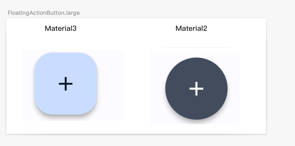
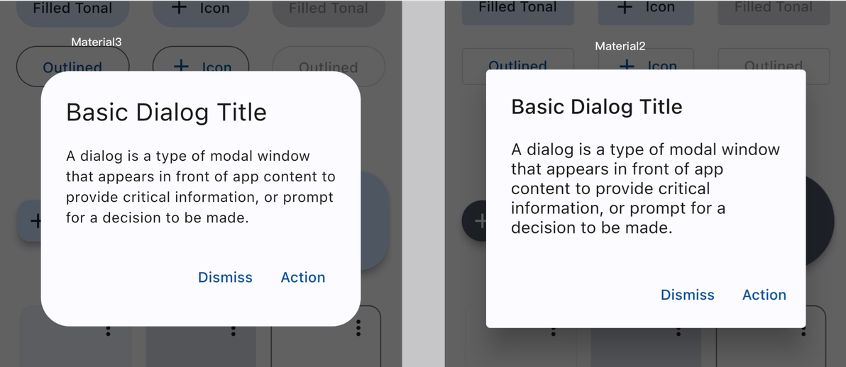
3 AlertDialog 的边框圆角改变
代码块
Dart
自动换行
复制代码
  void openDialog(BuildContext context) {
    showDialog<void>(
      context: context,
      builder: (context) => AlertDialog(
        title: const Text("Basic Dialog Title"),
        content: const Text(
            "A dialog is a type of modal window that appears in front of app content to provide critical information, or prompt for a decision to be made."),
        actions: <Widget>[
          TextButton(
            child: const Text('Dismiss'),
            onPressed: () => Navigator.of(context).pop(),
          ),
          TextButton(
            child: const Text('Action'),
            onPressed: () => Navigator.of(context).pop(),
          ),
        ],
      ),
    );
  }
复制成功
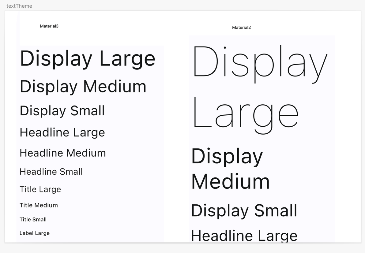
4 主题文本样式的默认大小改变
代码块
Dart
自动换行
复制代码
final textTheme = Theme.of(context)
        .textTheme
        .apply(displayColor: Theme.of(context).colorScheme.onSurface);

TextStyle large =textTheme.displayLarge;
TextStyle displayMedium =textTheme.displayMedium;
TextStyle displaySmall =textTheme.displaySmall;
复制成功
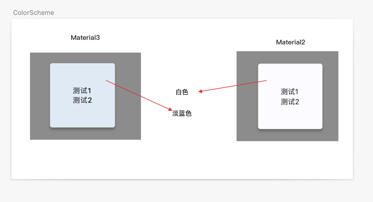
5 ColorScheme 的变更
代码块
Dart
自动换行
复制代码
Widget buildMaterial() {
   ///当前颜色主题
   ColorScheme colorScheme = Theme.of(context).colorScheme;
   //背景色
   final Color color = colorScheme.surface;
   //阴影色
   Color shadowColor = colorScheme.shadow;
   Color surfaceTint = colorScheme.primary;
   return Material(
     borderRadius: BorderRadius.all(Radius.circular(4.0)),
     elevation: 4,//阴影
     color: color,//背景色
     shadowColor: shadowColor,//阴影色
     surfaceTintColor: surfaceTint,//
     type: MaterialType.card,
     child: Padding(
       padding: const EdgeInsets.all(38.0),
       child: Column(
         crossAxisAlignment: CrossAxisAlignment.start,
         children: <Widget>[
           Text(
             '测试1',
             style: Theme.of(context).textTheme.labelMedium,
           ),
           Text(
             '测试2',
             style: Theme.of(context).textTheme.labelMedium,
           ),
         ],
       ),
     ),
   );
 }
复制成功
本文为我原创,未经授权禁止转载
cv19372293
分享至
投诉或建议
